Sharp Electronics
HR - Web Design and Communications Intern
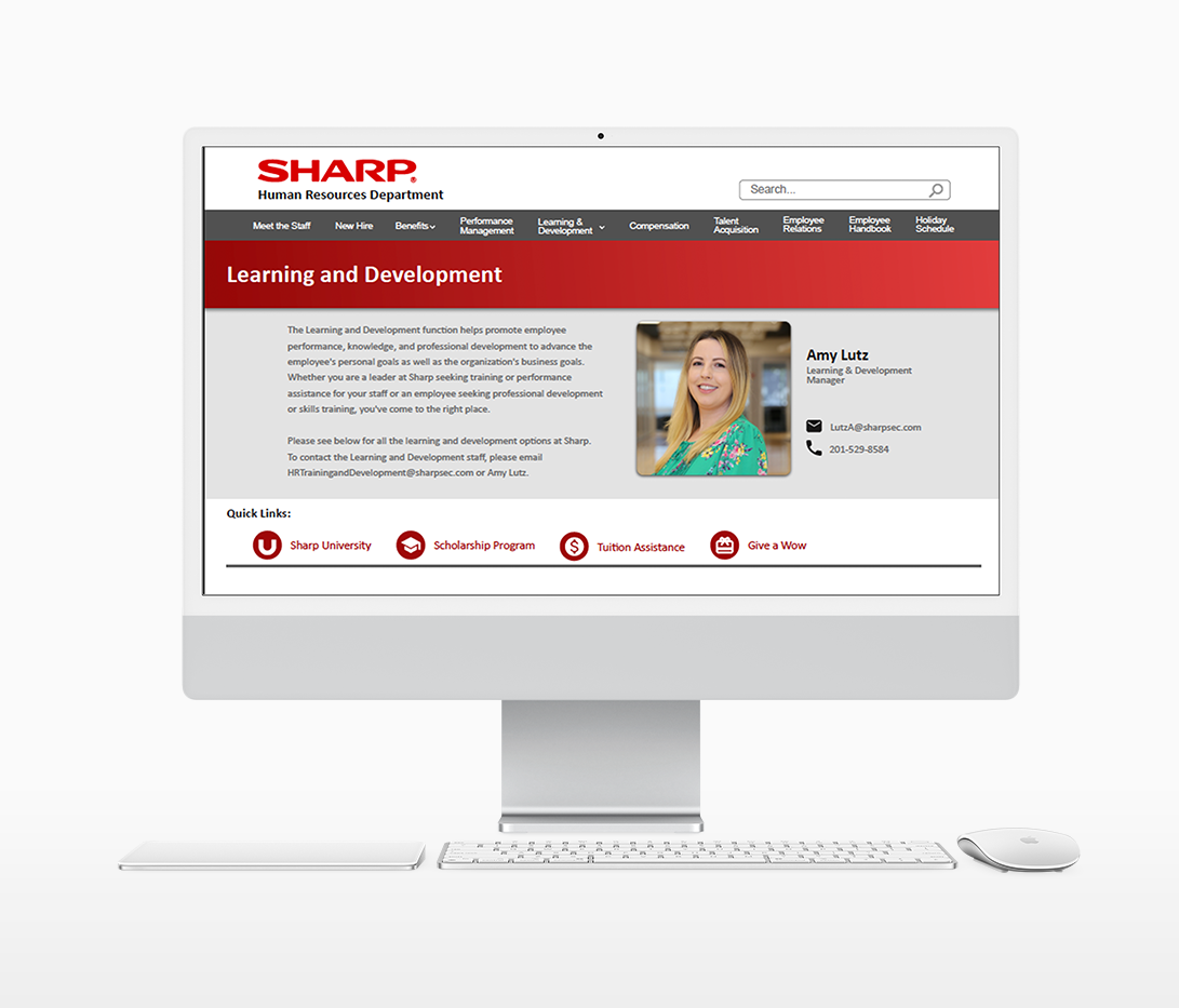
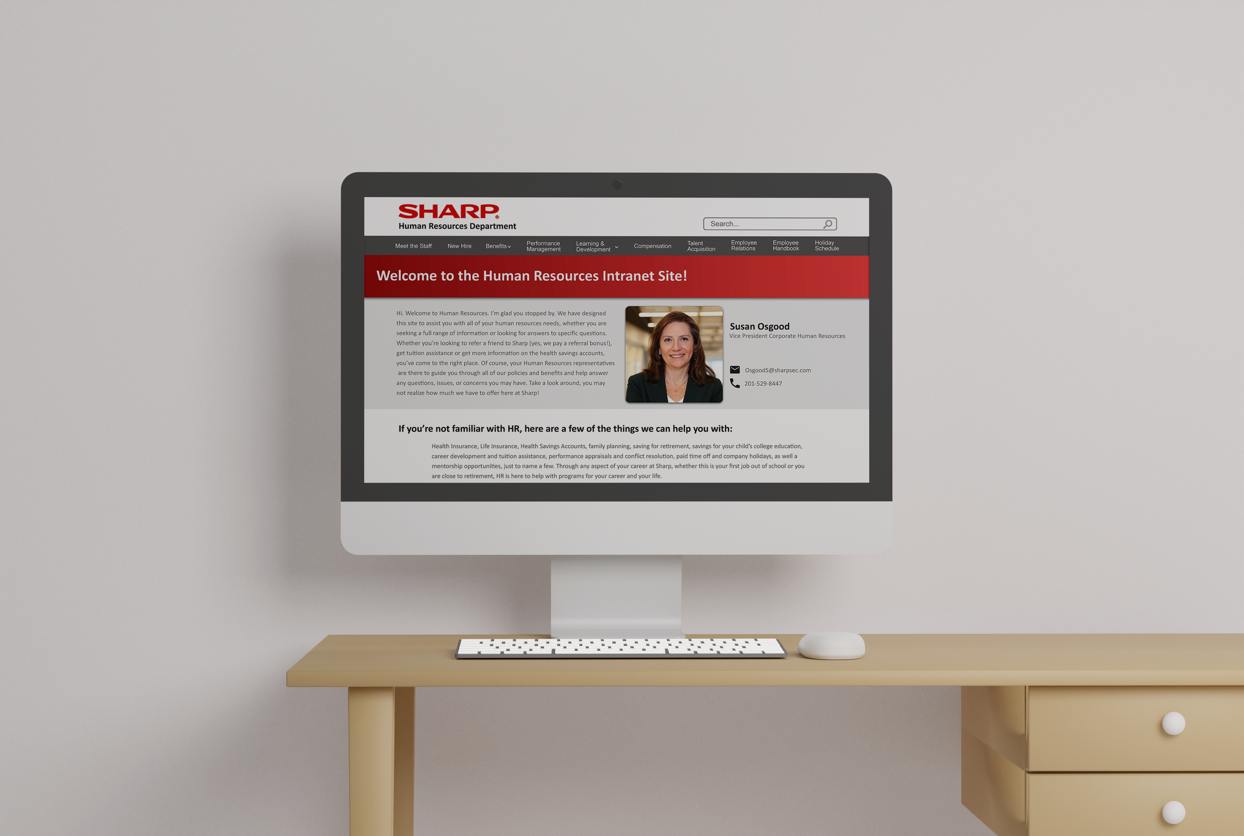
As a Web Design & Communications Intern at Sharp Electronics Corporation, my role was to redesign the Human Resources intranet site. I worked alongside the US Human Resources employees to reorganize, redesign, and prototype the site. Sharp employs over 50,000 people worldwide, with 64 bases in 30 different countries.
My Role: I conducted in-office research, site-mapping, sketching, wire-framing, UI design, and prototyping.
The Process
I began by completely deconstructing the original site. Then, I met with the representatives from each category of Human Resources to understand what information is relevant and what should be removed from the site.
I conducted in-office interviews with employees from all areas of Sharp to gain knowledge on what the consumer/employee felt was most important, missing, or ineffective with the current experience. This helped me better understand how to order and organize my information.
Next, I site-mapped using post-it's to create a movable diagram of the intranet categories. I used this to make it easy for me and my colleagues to move and reorganize information when needed.
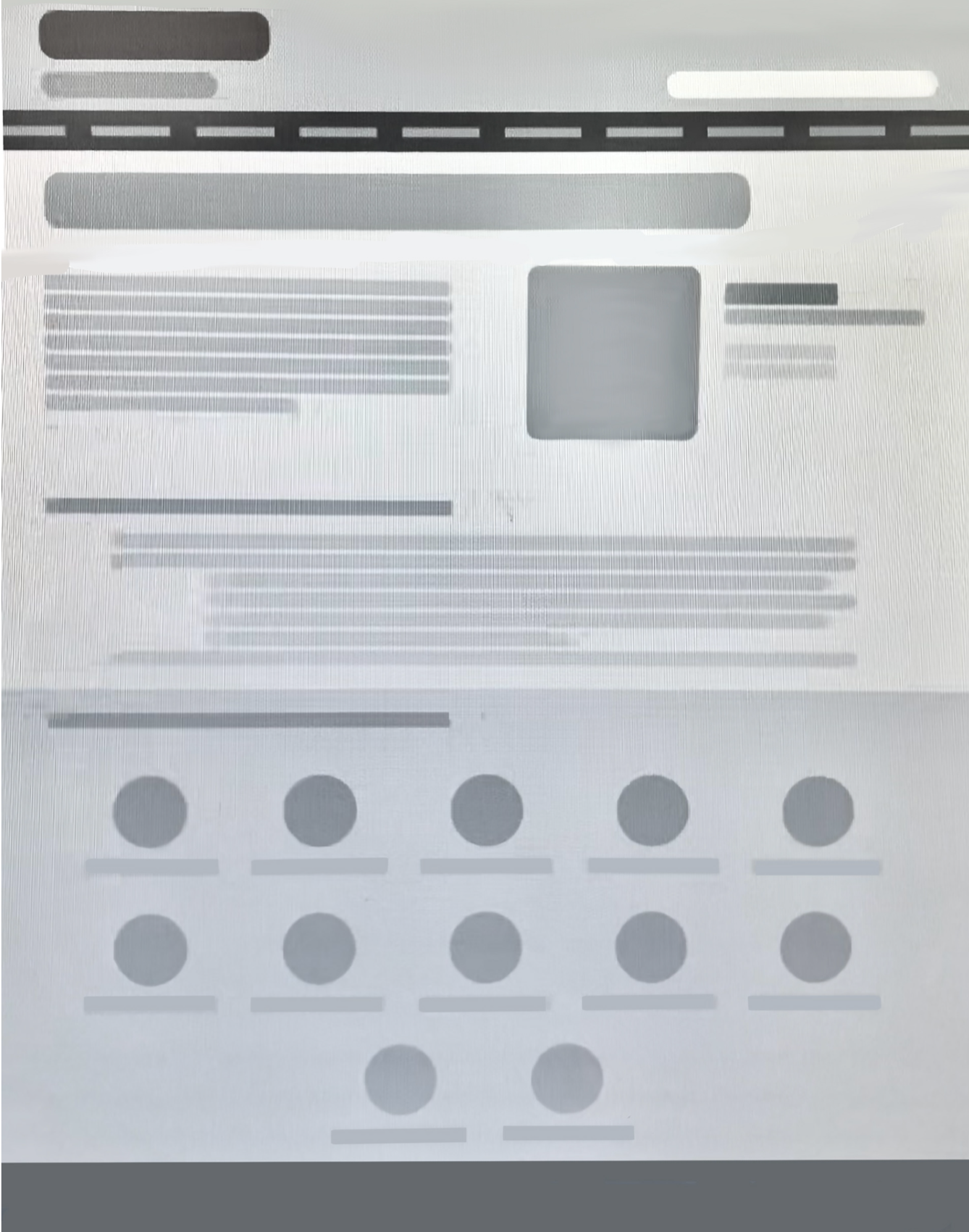
Finally, I used both sketching and digital wire-framing to create general layouts of my pages and allow for cohesiveness between each page of the site.
Challenges to Conquer
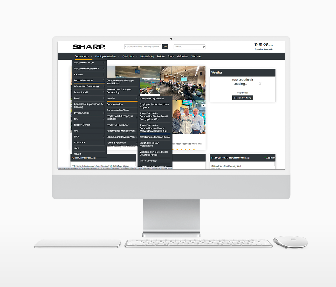
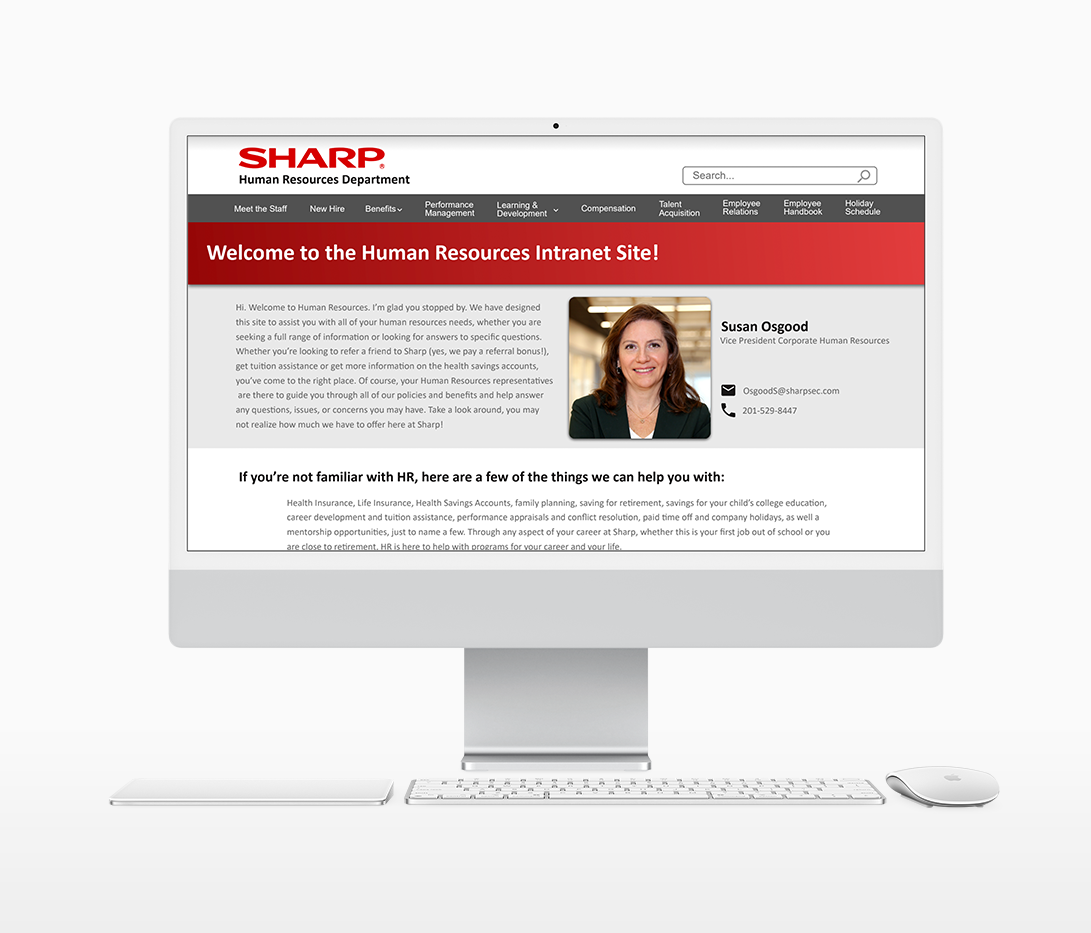
How can I redesign a site to make it easier for the user to navigate despite its large size and extensive content? I altered the site's navigation system to help the user better understand where to look for information and prevent frustration when navigating the page. On the side-by-side below, you can see the extensive drop-down menus that users originally had to open up in order to get to certain categories. I decided to make the Human Resources Intranet its own page in order to allow all of the current sub-categories to be easily visible. Furthermore, if you accidentally removed your hoover from the drop down menus, you would have to restart your search. Now, the drop down menus are opened with a tap action rather than a hoover action to prevent frustration when the menu accidentally closes out.
Before
Before
After
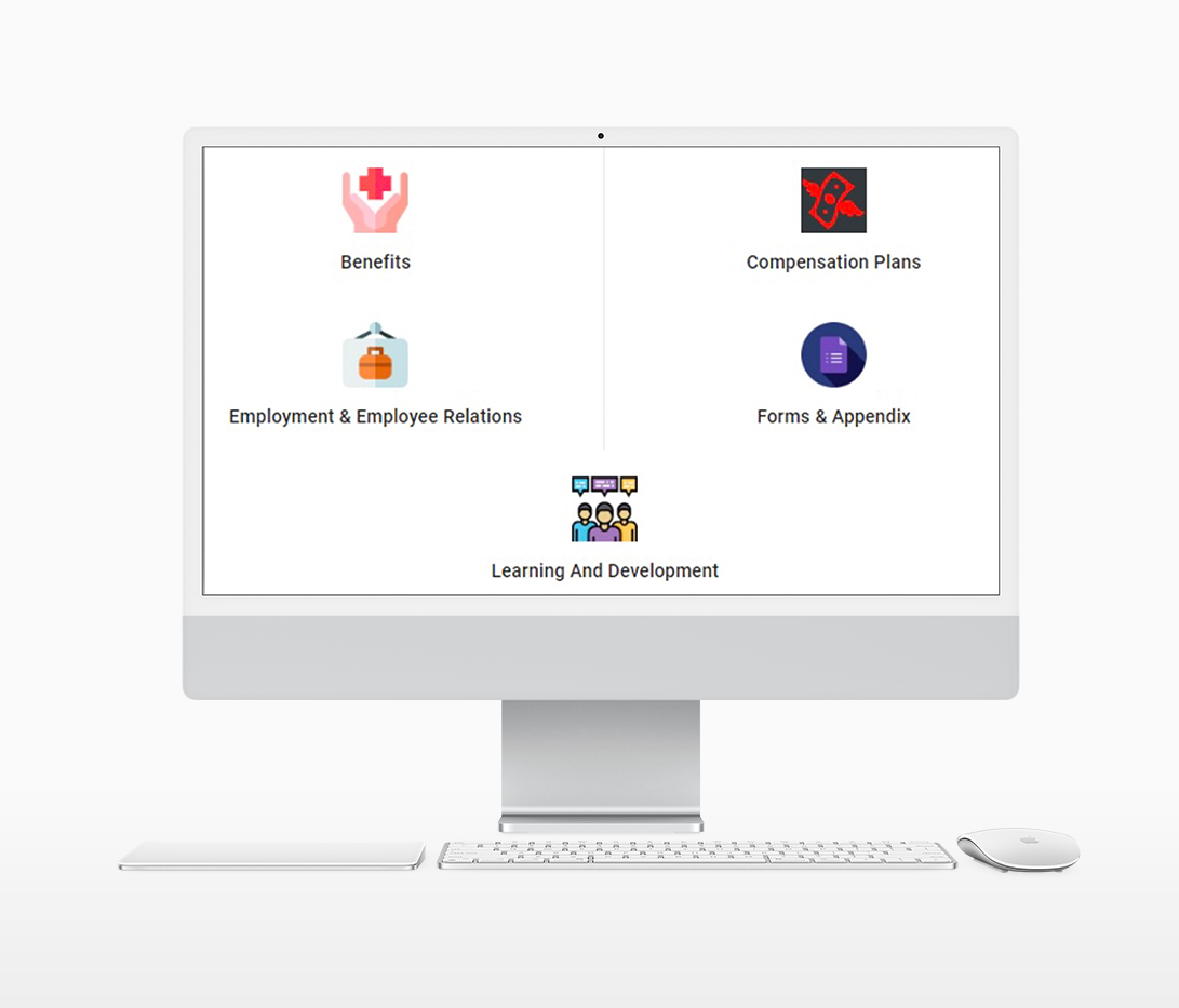
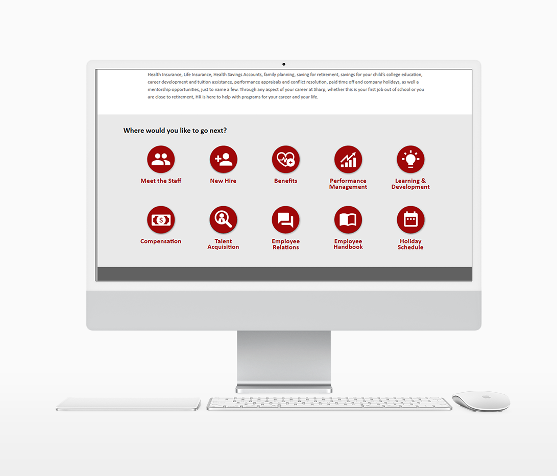
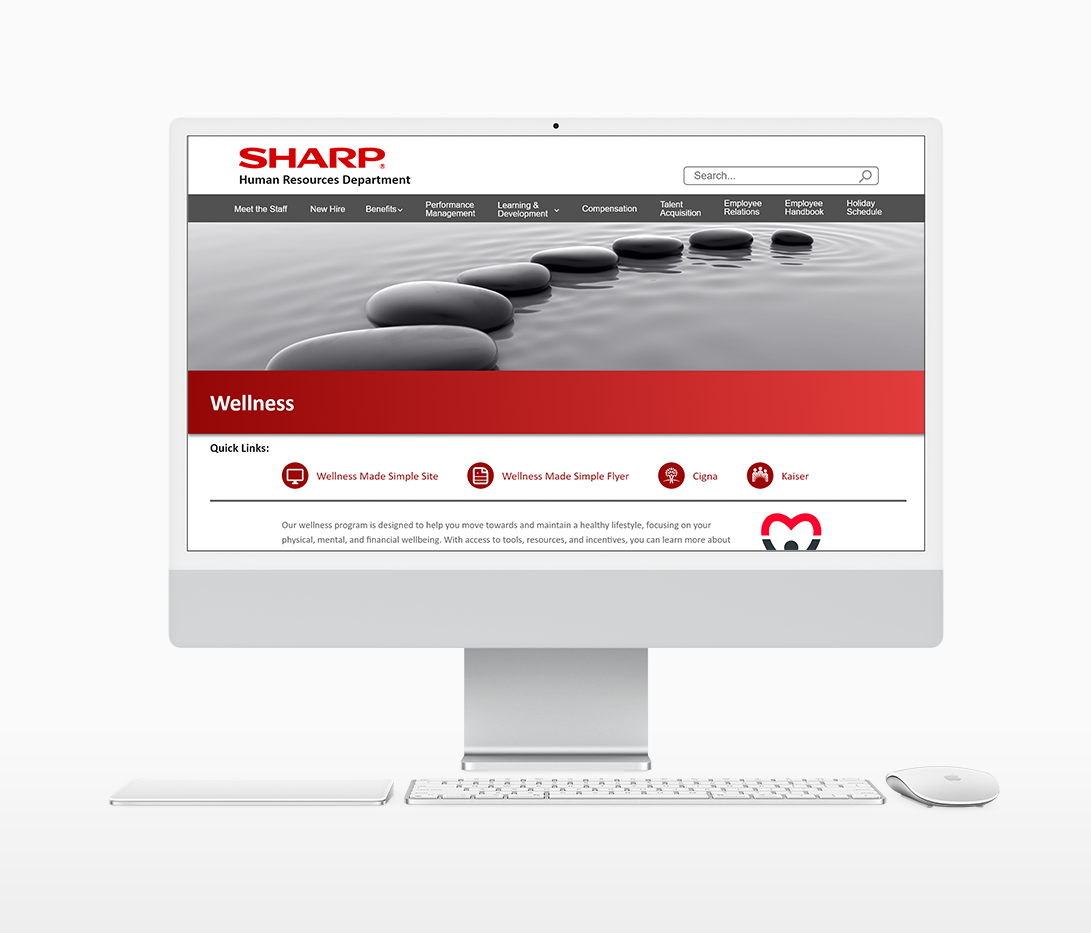
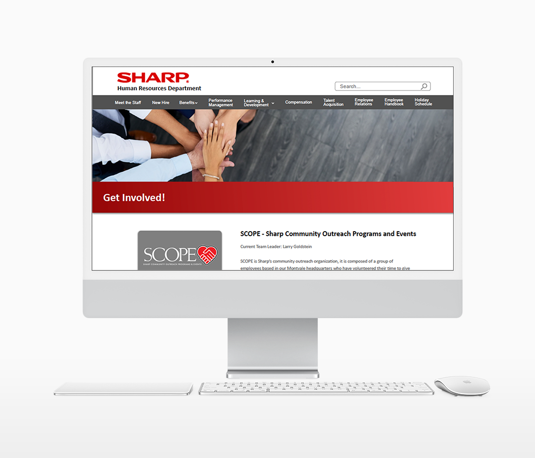
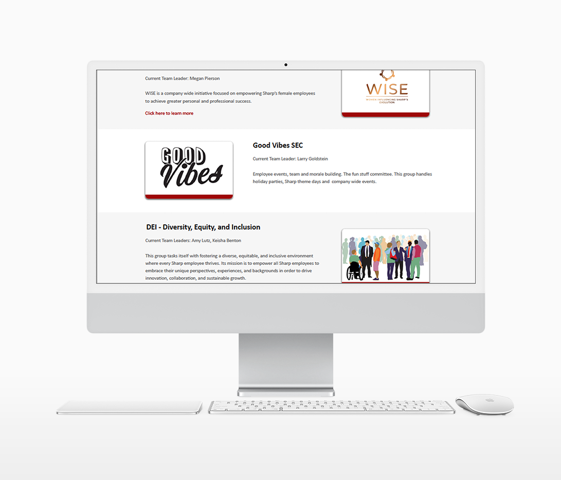
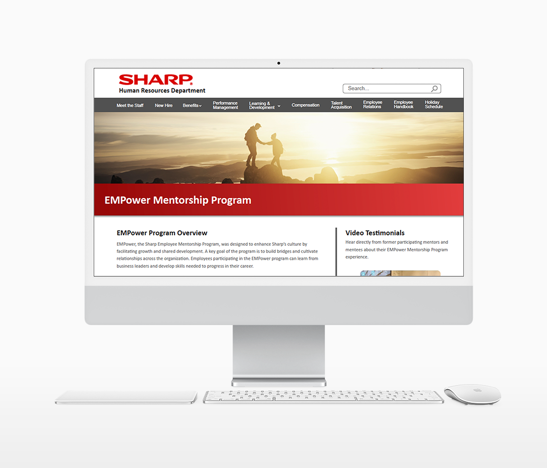
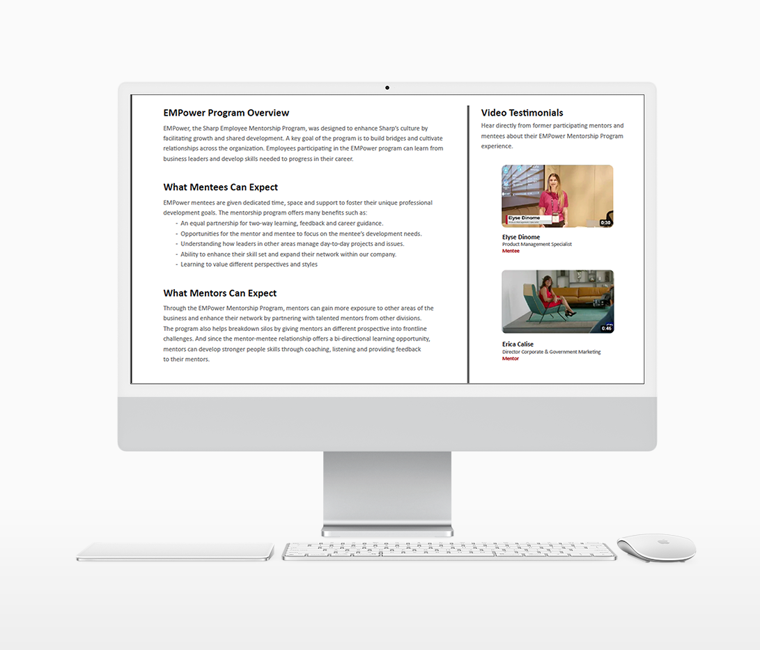
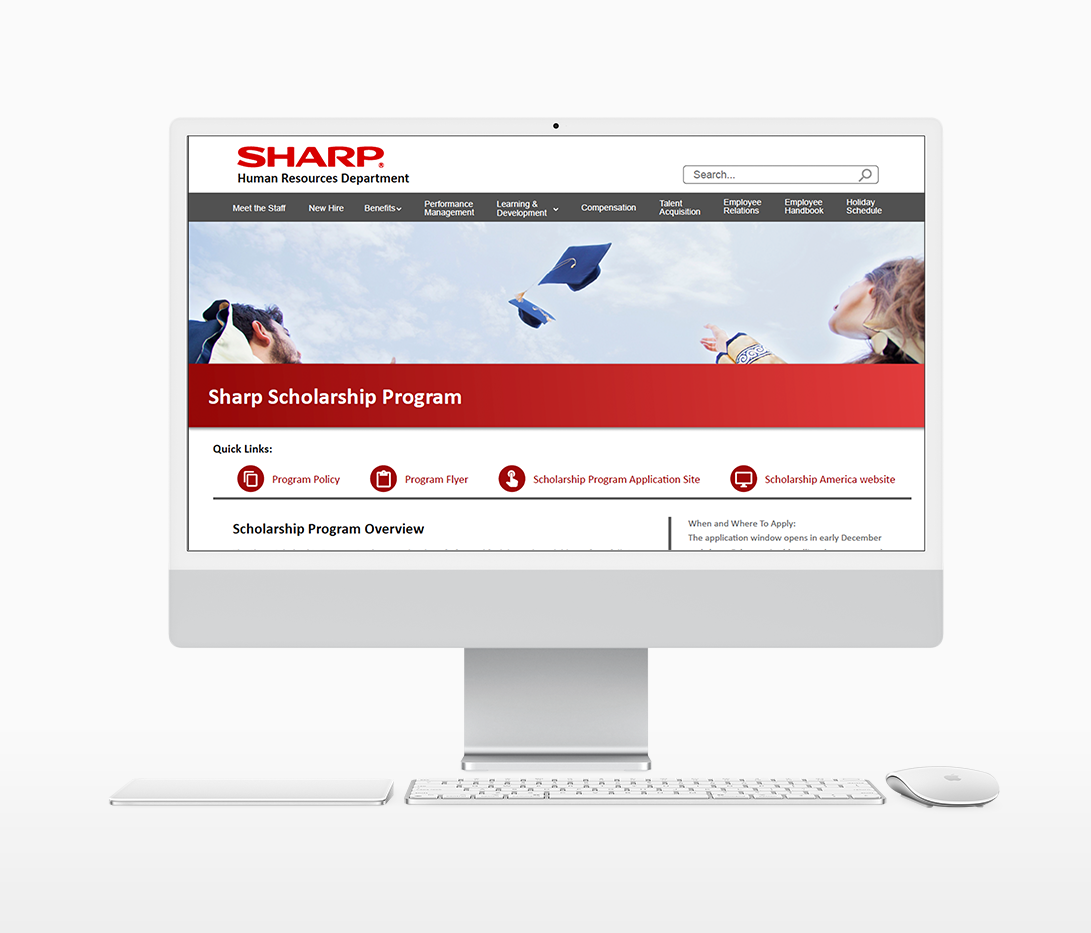
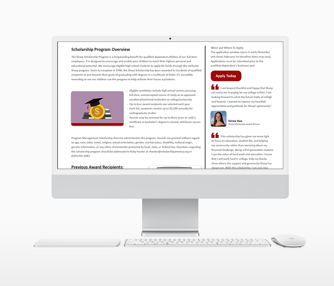
How can I combine so many Human Resources topics into one cohesive site? How can I maintain cohesiveness throughout? In the original intranet site, multi-colored and multi-shaped icons were used to represent different topics throughout the intranet page. As seen in the before and after below, I changed the style of the homepage icons to represent each specific category while maintaining visual stability and cohesiveness. Furthermore, I repeated elements throughout each page of the site: red gradient bar, curved image corners, phone and mail icons, circular quick link icons, font size, and color scheme.
After
Content Creation
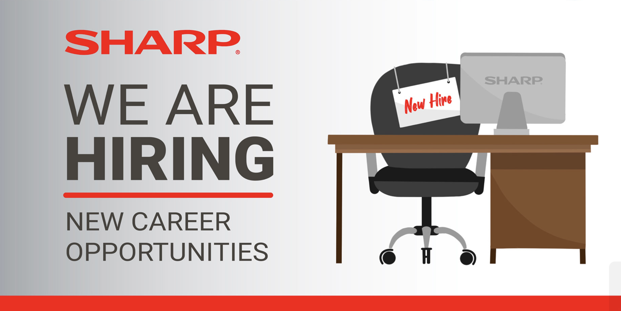
As a Web Design and Communications Intern for Sharp Electronics Corporation, I was tasked with assisting HR's senior recruiters to create hiring banners for company-wide email blasts.

